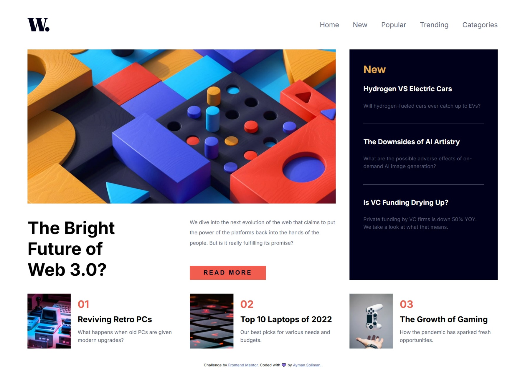


This is a solution to the News homepage challenge on Frontend Mentor. Frontend Mentor challenges help you improve your coding skills by building realistic projects.
Users should be able to:
- View the optimal layout for the interface depending on their device’s screen size
- See hover and focus states for all interactive elements on the page
- Solution URL: news-homepage-main
- Live Site URL: News Homepage
- Semantic HTML5 markup
- CSS custom properties
- Flexbox
- CSS Grid
- CSS Subgrid
- Desktop-first workflow
- JavaScript
- JavaScript Event Listeners
- Transitions
- Responsive Layouts
I learned how to build a responsive hidden burger menu using HTML, CSS, and JavaScript. This involved using hidden elements, CSS positioning, CSS transitions for smooth animations, and JavaScript event listeners to toggle the menu’s visibility by adjusting the menu’s position on the workflow.
<img id="menu__icon" src="/assets/images/icon-menu.svg" alt="icon-menu" />#menu {
height: 100vh;
width: 75vw;
background: hsl(36, 100%, 99%);
position: fixed;
top: 0;
transition: 0.5s ease-in-out;
z-index: 2;
}
.hidden {
right: -100%;
}
.visible {
right: 0;
}let menuIcon = document.getElementById("menu__icon");
menuIcon.addEventListener("click", () => {
menu.classList.remove("hidden");
menu.classList.add("visible");
});
iconMenuClose.addEventListener("click", () => {
menu.classList.remove("visible");
menu.classList.add("hidden");
});In future projects, I want to focus on responsively generated components. While I have learned how to create a burger menu, I want to refine my skills in dynamically generating and modifying UI elements based on screen size and user interactions.
Some key areas I plan to improve:
- Dynamic Component Rendering: Creating elements in JavaScript based on user actions or device breakpoints.
- CSS Flexibility: Enhancing my understanding of clamp(), min(), max(), and other modern CSS techniques for better responsiveness.
- Performance Optimization: Ensuring that dynamically generated components do not negatively impact page load speed and user experience.
- Kevin Powell’s YouTube Channel – This helped me with subgrid layout. I really liked this pattern and will use it going forward.
- Ahmed Shadeed’s Personal Blog – This is an amazing article which helped me understand everything about layouts in CSS, CSS techniques for better responsiveness using responsive units. I’d recommend it to anyone still learning this concept.
- Website – Ayman Soliman
- Frontend Mentor – aymansoliman-dev
- Twitter – @a_soliman1783
 https://github.com/ayman-soliman-1783/news-homepage-main

Leave a Reply